The name & the mark
Why is it called Warrior Woodworks anyway?
The name and the logo weren't chosen at random. They're a nod to an ancient story, a middle name, and a quiet stand for something that matters.
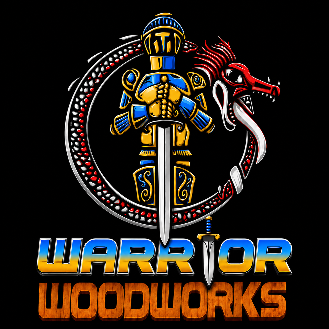
The logo was carefully chosen to artistically represent the ancient story of St. George and the dragon — an epic tale of a brave knight who slew the dragon that tormented a town. It's a story I've loved for as long as I can remember.
I chose this image because George is my middle name, and I have always been fascinated with tales of knights and dragons. In a broader sense it also represents the eternal struggle of good versus evil — the small, brave thing standing up against the large, terrible thing.
Recently I added colour to the mark: blue and yellow on the knight, and red and black on the dragon. It's a way of showing my solidarity with Ukraine's struggle against the evil advances of the Russian government.
I lived in Ukraine for a few years. I understand and love the people and the country, and the colours are a small, personal way to carry that with me into everything the studio makes.
The knight — blue & yellow
The colours of the Ukrainian flag, carried by the knight who stands for the brave and the good.
The dragon — red & black
The colours of aggression, carried by the dragon that stands for the force the knight must face.
Beauty and functionality.
Every piece is made to be held and used — and to carry a little of the story with it.